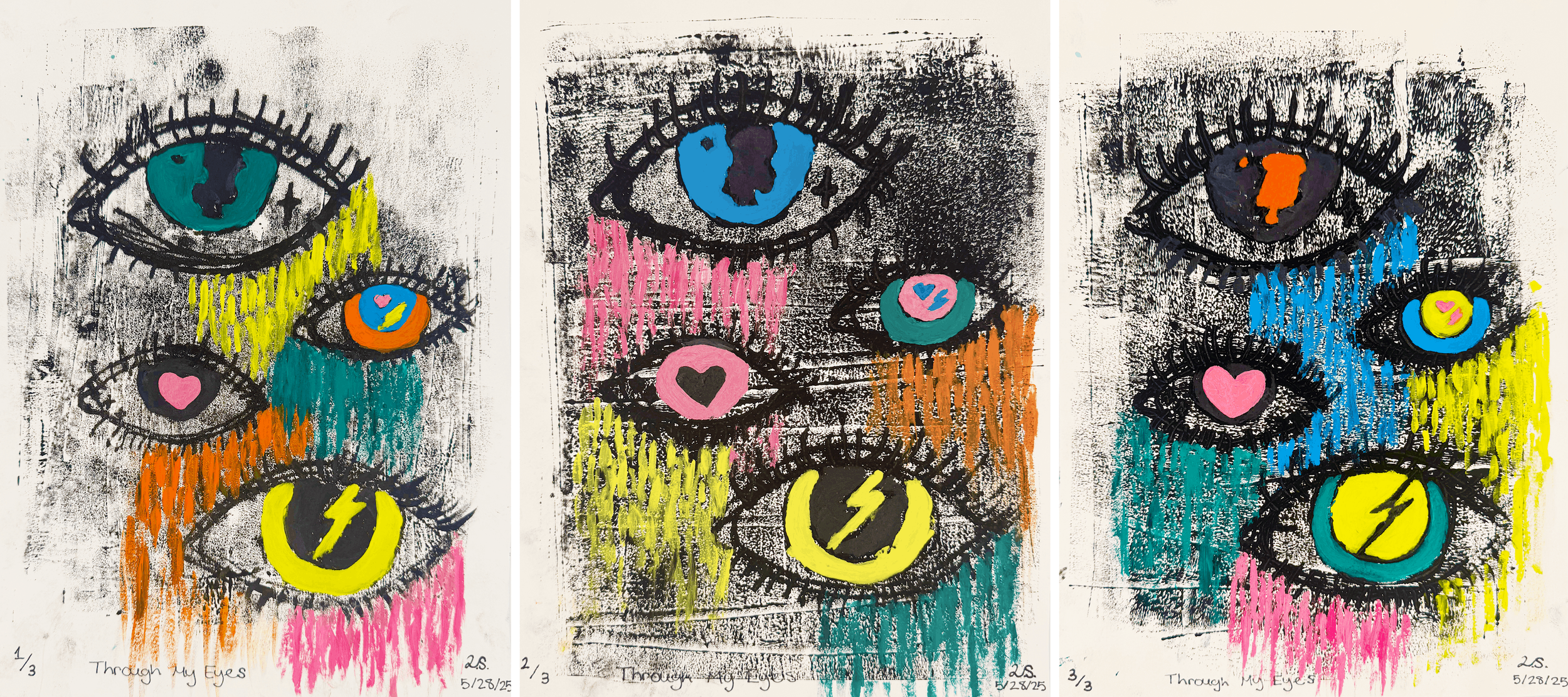
Through My Eyes, 2025, printmaking, series of 3, 9” × 12” each
The three-part printmaking series “Through My Eyes” looks at how we perceive and experience the world around us. A collection of stylized eyes is shown in each print, serving as a metaphor for how we process emotions and experiences. The eyes are more than just physical characteristics; they are symbols of identity, emotion, and memory. To show various emotions and concepts, such as love(hearts), awareness(eyes), luck(clovers), and strength (lightning bolts), I used striking neon primary and secondary colors. While the changing colors illustrate how our feelings and opinions can evolve, the same eye design that appears in all three prints fosters a sense of connection, despite their differences. The uneven and imperfect ink serves as a reminder that our perception of the world is messy, emotional, and human, and is not always clear or perfect.
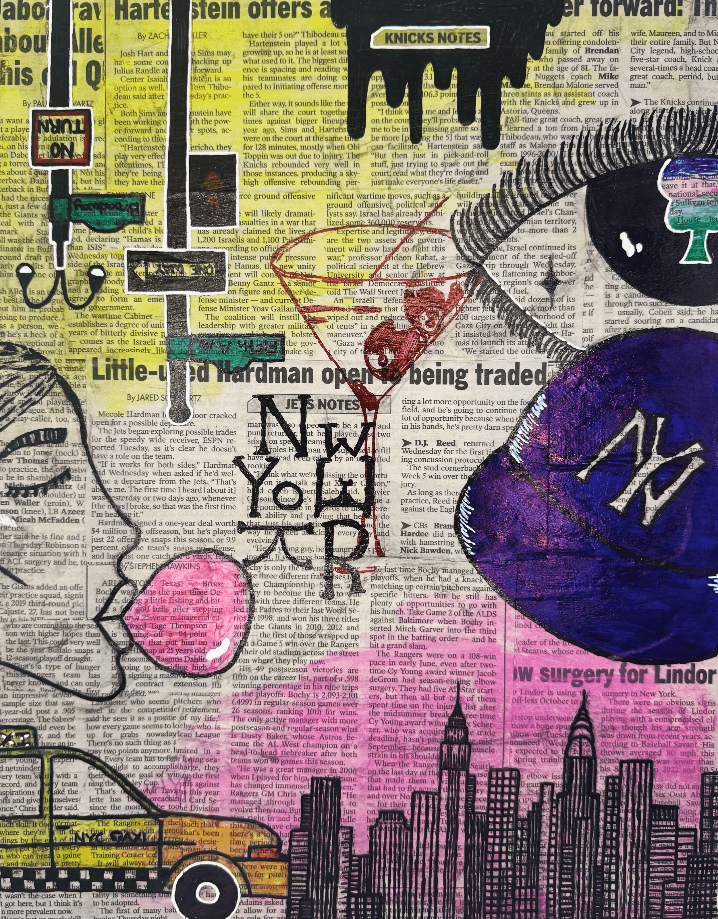
The City that Never Sleeps, 2025, marker and gouache and collage, 11”x14”
I was inspired by pop art and artists like Andy Warhol and Jean-Michel Basquiat. I love how their work feels alive — full of color, energy, and pieces of everyday city life. Their art doesn’t try to be perfect; it’s messy and bold, and that really connects with me.
I chose this influence because I’ve always been drawn to the feeling of big cities, especially New York, because it is where I am from. It’s loud, creative, and full of personality. I used newspaper in my background to show how the city is always moving and full of fun sports stories, then added bright colors and symbols like the taxi, skyline, and a Yankees hat to capture its vibe. This influence helped me be more open and expressive in my art — to not worry about being too neat, but to focus on showing feeling and movement.
My artwork is about the energy of New York City — how it never sleeps, and how everything feels alive. I used layers of newspaper, markers, and gouache to create that sense of motion and chaos. The colors and drawings represent both the beauty and the craziness of the city. I wanted it to feel fun, bold, and a little overwhelming — the same way it feels to walk through New York.
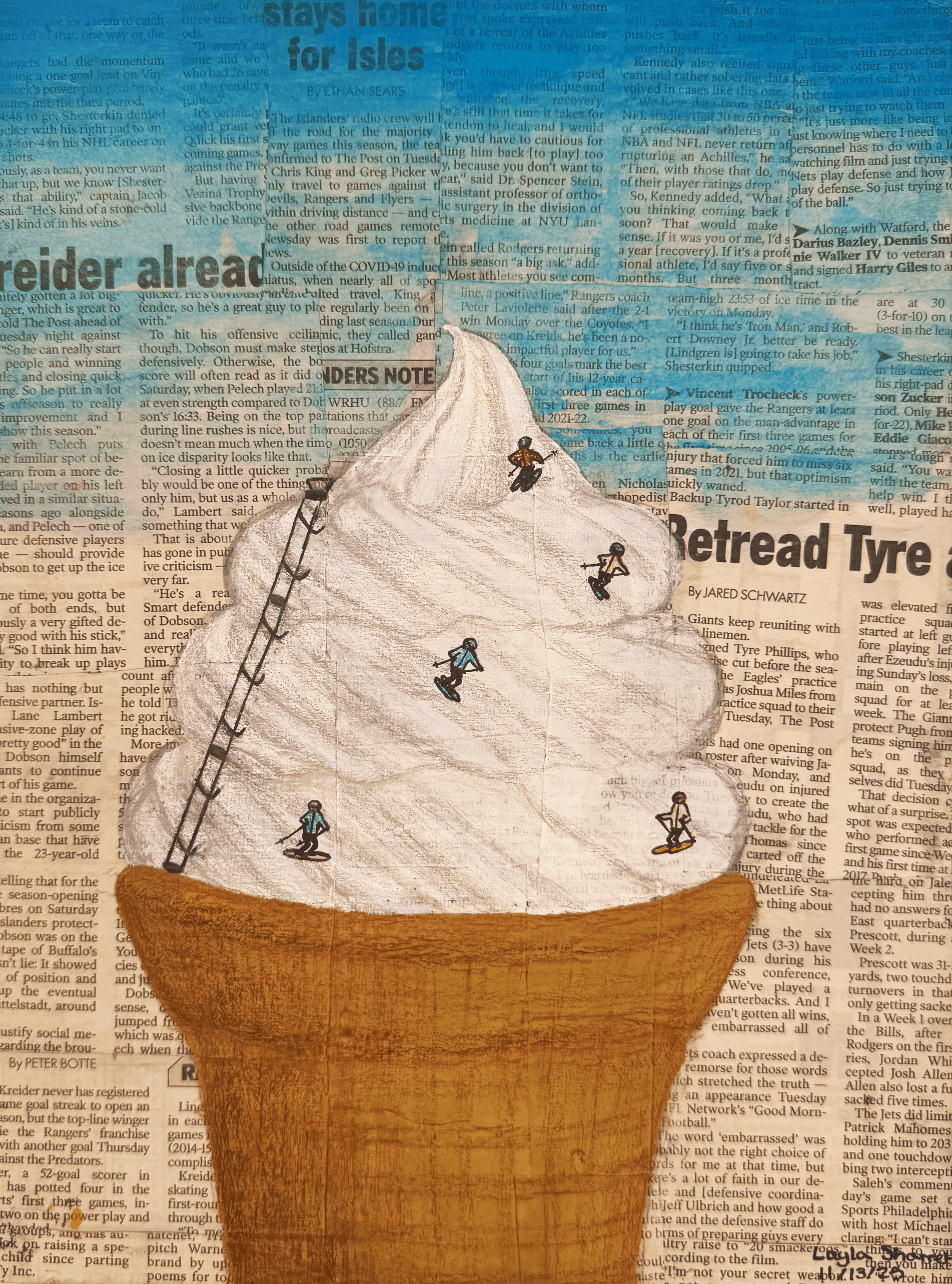
Skiing the Scoop, 2025, color pencil, gouache, collage, 9”x12”
My artwork mixes the feeling of summer and winter by turning a soft serve ice cream cone into a snowy mountain filled with tiny skiers and a chair lift. I used Mod Podge to layer the newspaper pieces so they would create an interesting, textured base that feels busy and full of movement. Then I painted the sky and base of the ice cream with gouache and used colored pencils to draw the small skiers, ice cream/mountain, and cone so they would stand out clearly. By combining warm, summer imagery with a cold winter activity, I aim to show viewers how a delicious piece of food can become something completely different depending on how you see it. The mix of both seasons and materials helps create a fun, unexpected world where summer and winter meet.